What’s New in FLIGBY v2.0
FLIGBY v2.0: Redesign after eight years of global service
FLIGBY v2.0 is finally here. After eight years of intensive service to more than 22 thousand individual users worldwide, the award-winning FLIGBY simulation gets a brand new outlook and extended functionality.
New features in upcoming FLIGBY v2.0 updates will help you manage your time dedicated to experiential learning more effectively with its new 7-episode setup. It will increase security with its HTML-5 coding and provide a better overview of your decision’s consequences with its redesigned Flow-map. This update of FLIGBY is a decisive step toward the interactive movie genre. FLIGBY’s new, adaptive UI design will also make it easier to use different devices. You can start your personal development journey on your laptop and continue across other devices, including tablets and smartphones. Check out the new features of the redesigned FLIGBY simulation:
From serious game to an interactive movie
Per definition, FLIGBY is a serious game in an interactive movie format. Now, with FLIGBY 2.0, it’s time to change the genre. Meeting our users’ expectations, we will emphasize the movie qualities to provide more engagement for experiential learning.
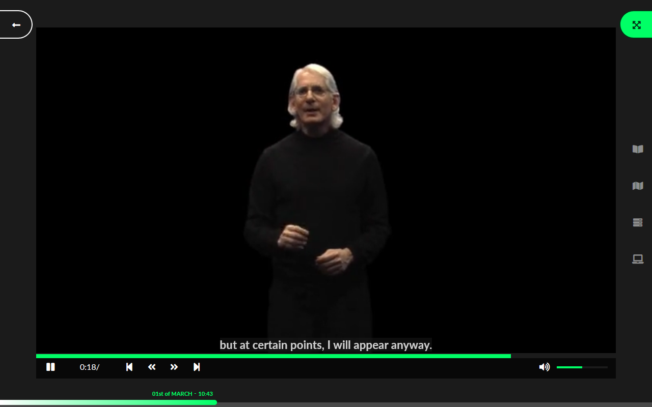
We increased the space dedicated to the film on the main user interface. Therefore the renewed FLIGBY has more of an interactive miniseries look than a serious game. That’s a definitive move toward the entertainment direction, focusing more on the story, the characters, and the interpersonal conflicts among them.
Enhanced entertainment factor: Turul’s story regrouped into seven episodes
In line with the OTT video consumption trends, FLIGBY v2.0 gets an interactive mini-series-like setup. Our developers regrouped the original 23 scenes into seven 45-minute episodes, just like a season of your favorite television series. It will help users to manage their time more effectively by following patterns they prefer when using video and game streaming services.
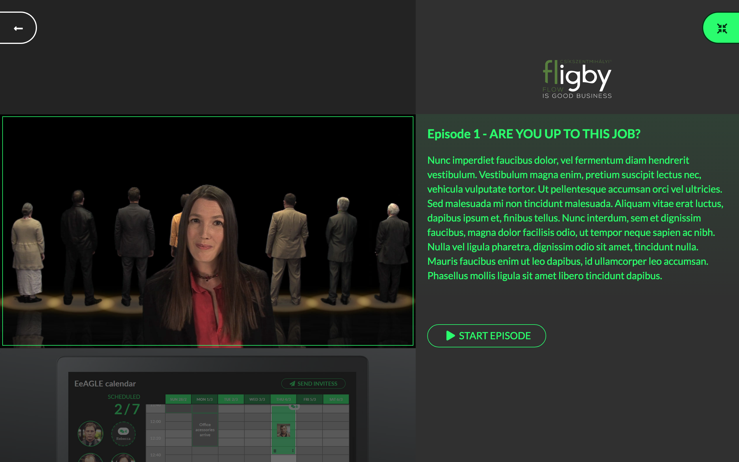
For more advanced navigation, we have created a unique episode selector surface with a short description of each episode.
More direct and dynamic feedback with FLIGBY 2.0
One of FLIGBY’s most valuable benefits is that it shows your managerial decisions’ impact in real-time. You decide as Turul Estates general manager and see the immediate reaction of your colleagues. This includes indicating their instant mood changes, which unfold under normal circumstances. Flow-map visualizes your colleagues’ psychological state and provides information on their motivation. Prof. Csikszentmihalyi developed the flow-map, first published in his bestseller, “Good Business.”
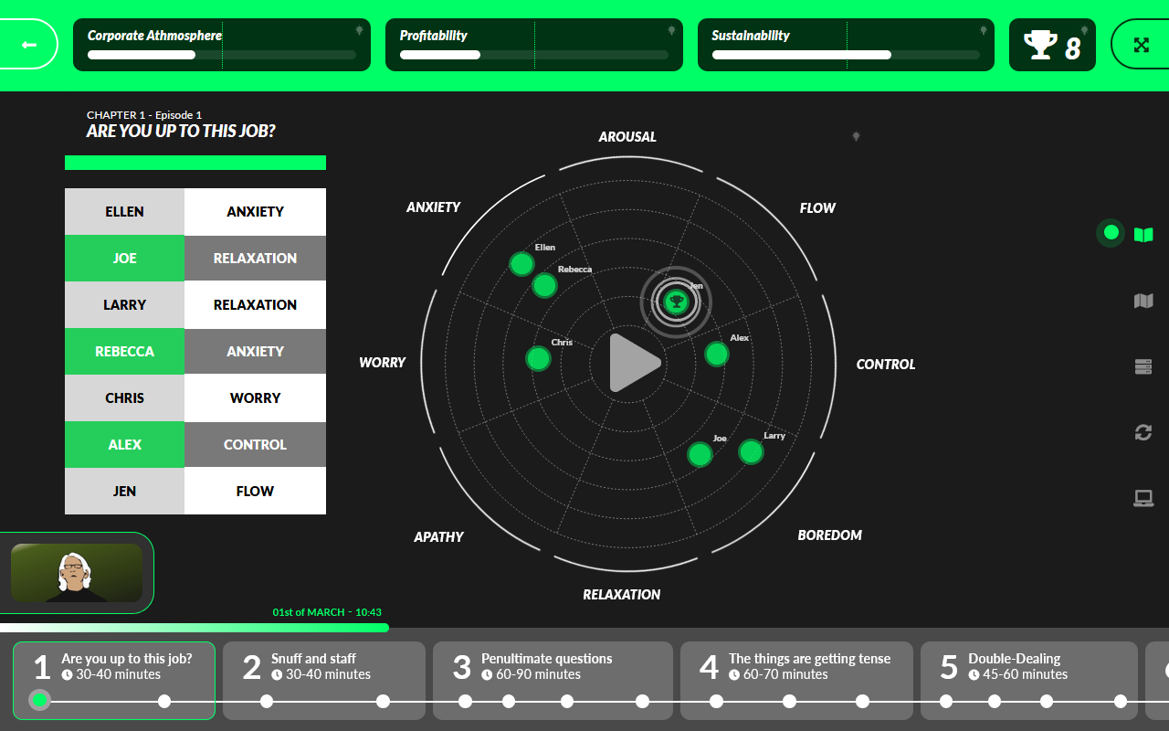
Now your virtual colleagues’ movements on the Flow-map are shown right after every decision you make. (You do not have to go to the feedback section leaving the primary user interface, the Flow-map displays automatically.) It helps you to understand the consequences of your leadership behavior on the go. For this, we implemented a particular layer over the video screen. It’s like a head-up display and indicates all significant changes without disturbing the flow of the story.
UI optimized for mobile devices
Many FLIGBY users are waiting for this: making our simulation more suitable for mobile devices. This is a significant trend also on the market of learning&development applications: using them on the go.
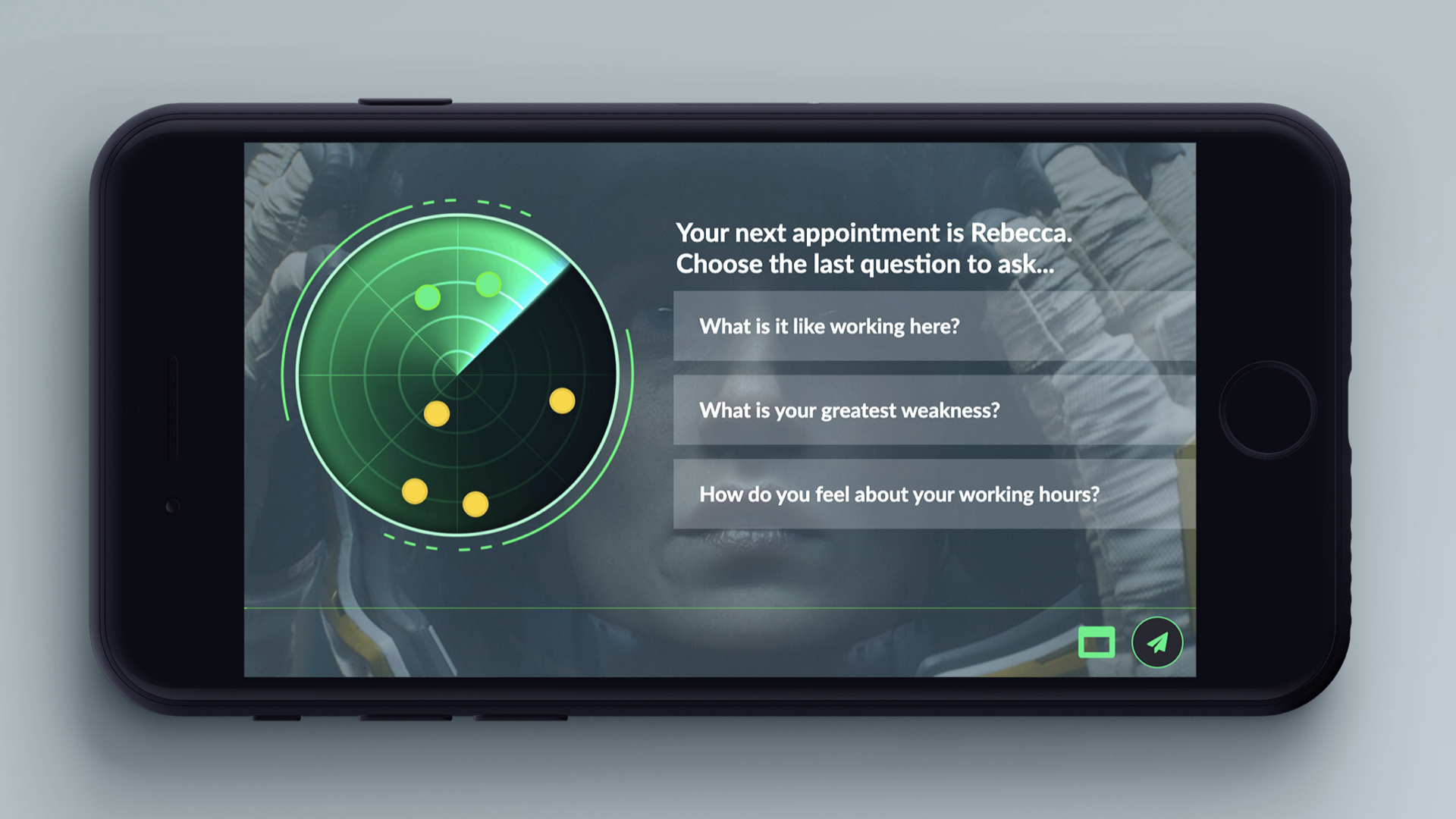
With its adaptive UI design, you can use FLIGBY v2.0 easily on your tablet or smartphone, just like your favorite video streaming service.
Redesigned “Interview challenge”
Interviewing your staff is essential when you take over the general manager position at Turul Estates. It provides the opportunity to get to know them better and to understand their expectations of your person. Long story short, it’s a strategic moment.
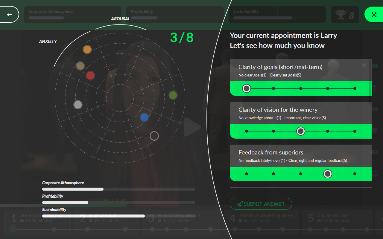
The interview exercise seemed too long, and some of our users found the feedback received from Mr. Fligby a bit much in many cases. Our experts redesigned this part of the simulation to ensure a smooth flow of the events.
Media Library Light
The user’s perception of this function could have been more consistent: some liked it very much, and others found it less helpful considering the lengths of the texts. Based on the valuable feedback of the FLIGBY community, we decided that the Media Library has to be renewed—fewer texts with more direct links to the actual happenings of the story. We call the new solution “Media Library Light,” referring to the compact selection of the original items. No worries, all original entries will still be available, but newly as a function of the Metrix (FLIGBY’s account management and reporting module). We will launch this feature early next year.
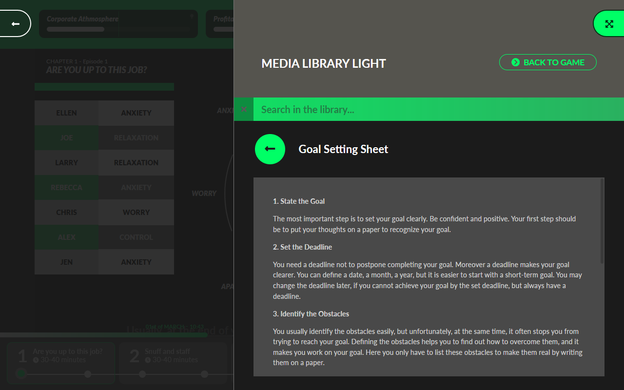
The good news is that the short videos will be re-edited, too, offering a more direct explanation of the given topics. No more squirrels before Prof. Csikszentmihalyi’s explanation; I’m sure that hardcore fans know what I’m talking about 🙂
My Computer
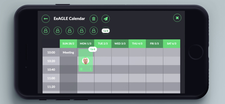
In the FLIGBY story, you take the leading role as the general manager. You decide, based on the information provided by different sources, including the emails of your people. To give you a more comprehensive overview of these messages, we created a function called “My Computer.”
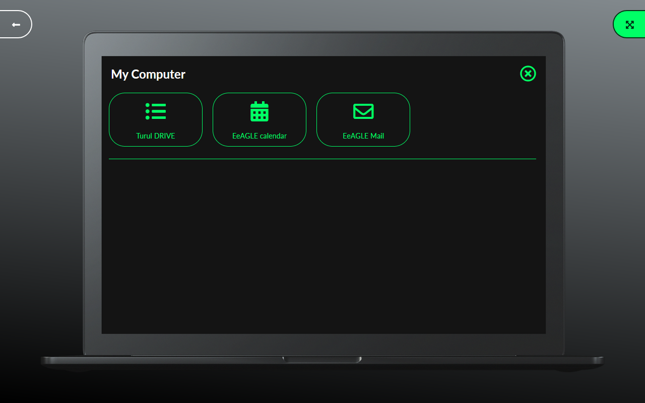
Click on its icon to find all the emails in one place, just like on your real computer. And there is also the Turul Drive, providing you access to specific new contents, like HR files or the archive of board meeting memos.
